FinTech Automation Website Redesign
A modern, clear, and more conversion-focused website for a growing client base.
Role: UX/UI Designer
Timeline: 8 Weeks
Platform: Web, Mobile
Stakeholders:
CEO, FinTech Automation
Head of Marketing
Sales Team
Product Manager (Portfolio Companies)
Overview
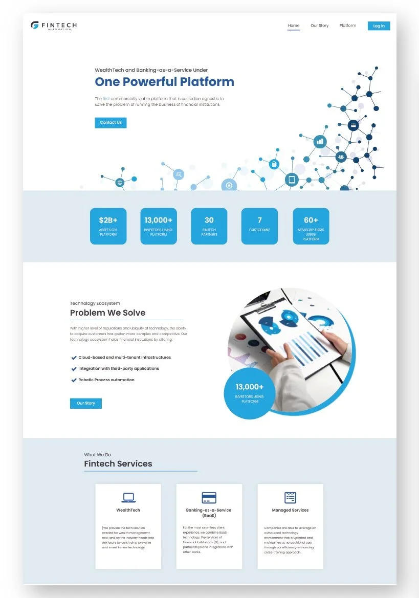
FinTech Automation needed a website that better reflected its brand and could support a rapidly growing client base. The original site was outdated, text-heavy, and lacked a clear path for users to understand FTA’s value. I was responsible for leading the UX/UI redesign from research through final high-fidelity designs.
The Challenge
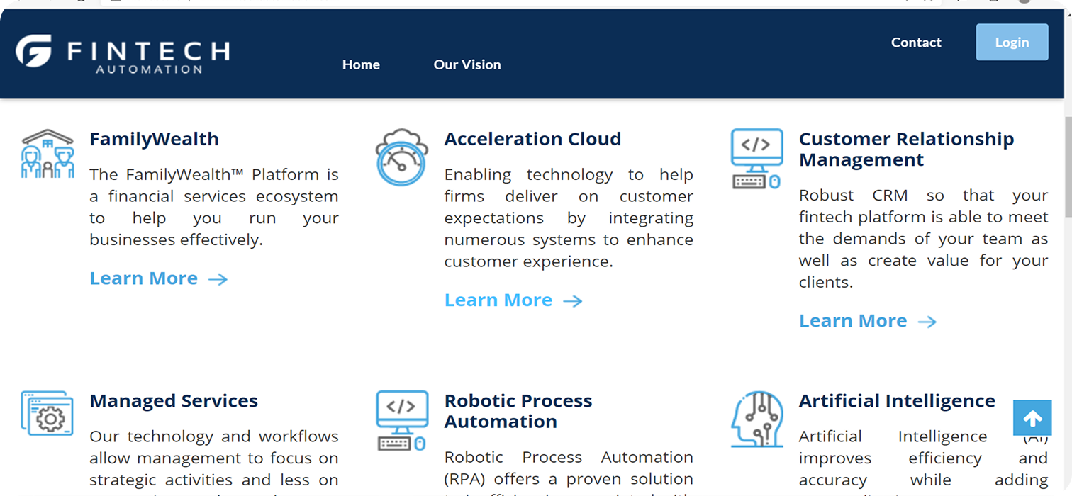
The existing FTA website wasn’t aligned with their evolving brand or user needs. It suffered from:
An outdated visual style
Heavy text with minimal supporting visuals
An unclear information hierarchy
Weak or difficult-to-find calls to action
The goal was to create a more intuitive, visually appealing experience that clearly communicated what FTA does and guided users toward engaging with the team.

My Role
As the UX/UI Designer, I led end-to-end design including:
Stakeholder + user interviews
Competitive + UX research
Information architecture restructuring
Wireframes
High-fidelity UI designs
Interactive prototypes
Usability feedback + iteration
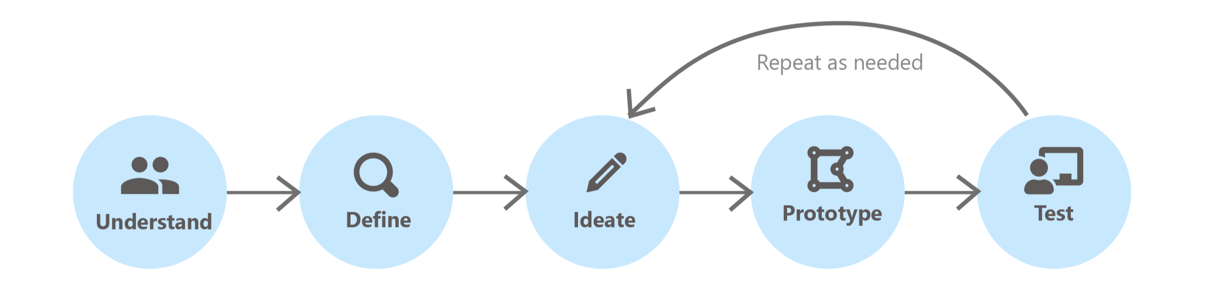
My process
-
Reviewed the existing website
Interviewed internal teams and users
Identified pain points and conversion blockers
Analyzed competitor websites
-
Reorganized navigation
Simplified website structure
Created clear CTAs for different user groups
-
Built low-fidelity flows to test hierarchy
Established visual rhythm with more imagery and spacing
-
Implemented refreshed brand elements
Created clean, modern layouts with high scanability
Strengthened CTAs and sign-posting
-
Tested flows with internal team
Iterated based on feedback from Sales + Marketing
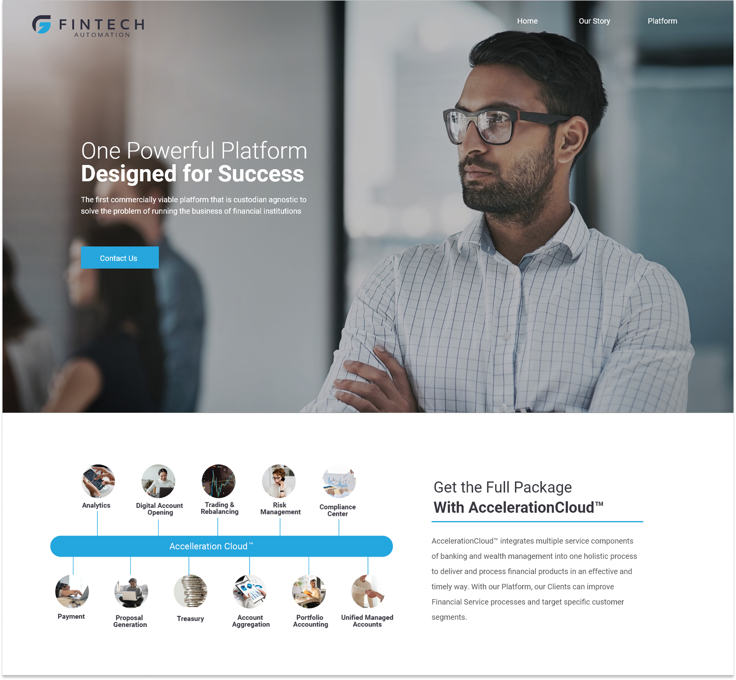
Final Design

Results
Stronger brand alignment
Clearer user pathways
Increased scanability and visual engagement
Modern, flexible design system for future updates
What I learned
This project reinforced the importance of simplifying complex information, especially in the fintech space. Clear hierarchy and strong visual support can dramatically improve engagement. It also highlighted how valuable stakeholder collaboration is. Early alignment made the design process faster and more focused.