0→1 • Regulated Servicing • Guided Experience
Crisis Navigation: Financial Recovery After a Total Loss
Helping auto loan customers manage the financial and logistical stress of a totalled vehicle.
Highlights
Lead Product Designer, Researcher & UX Writer
Role
Platform
iOS, Android, Web
15% increase in payer rate
🏆 Awarded Mark of Distinction
Duration
7 Months
Impact
Company
Capital One
Executive Summary
When a vehicle is totaled, customers enter a "black hole" of information. Without a digital dashboard, they were unsure how to deal with insurance, what documents were needed, or if they should continue making loan payments during the resolution period.
The Problem
Developed the first-ever digital experience for customers navigating the "total loss" of a vehicle. This project transformed a traumatic and opaque financial process into a guided, transparent journey that significantly reduced call volume and improved loan repayment rates.
My Approach
My goal was to turn a fragmented, anxiety-inducing process into one guided experience — flexible enough to handle every version of a total loss, but simple enough that a stressed customer could see exactly what's next for their loan payoff at a glance.
Discovery
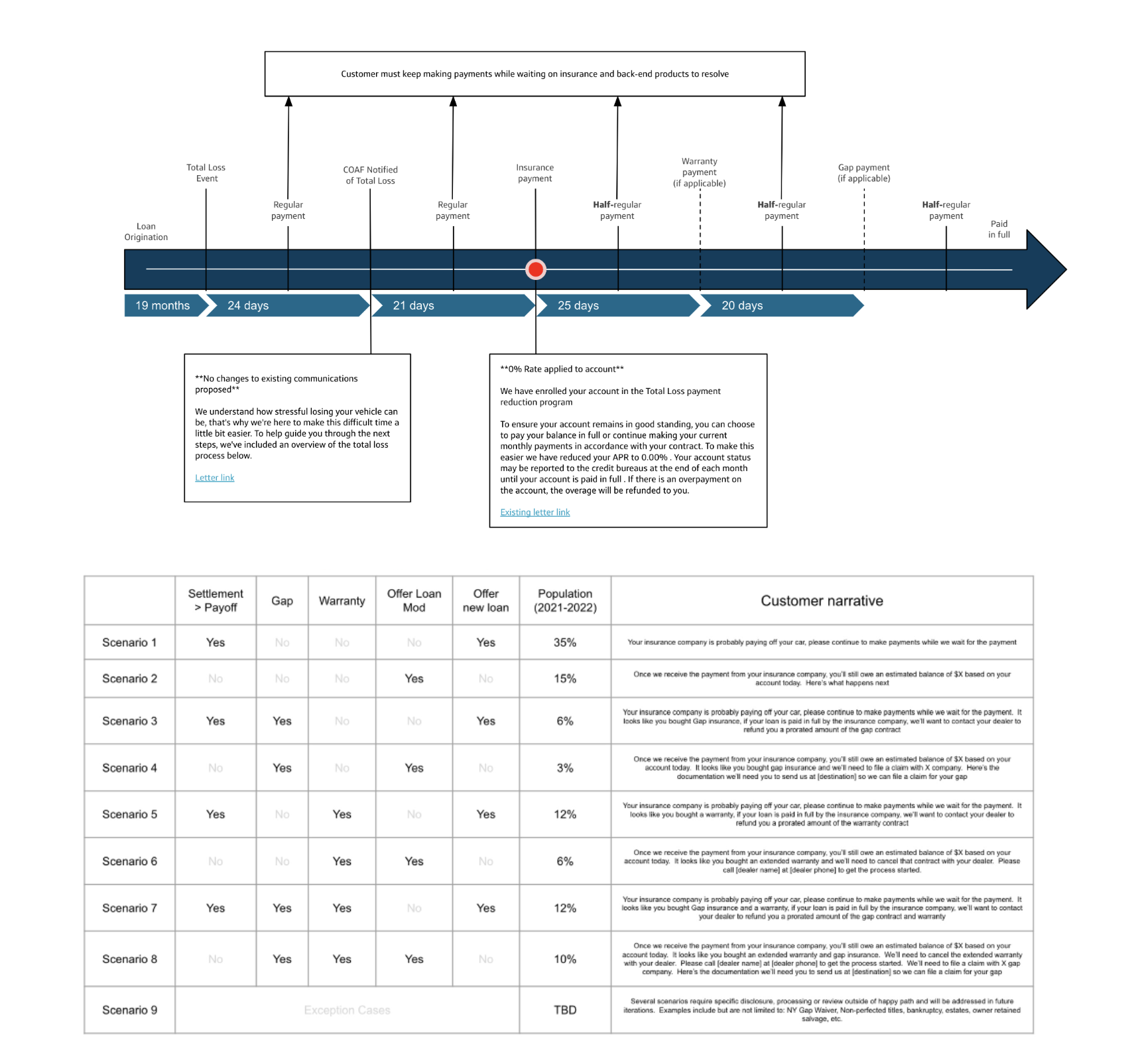
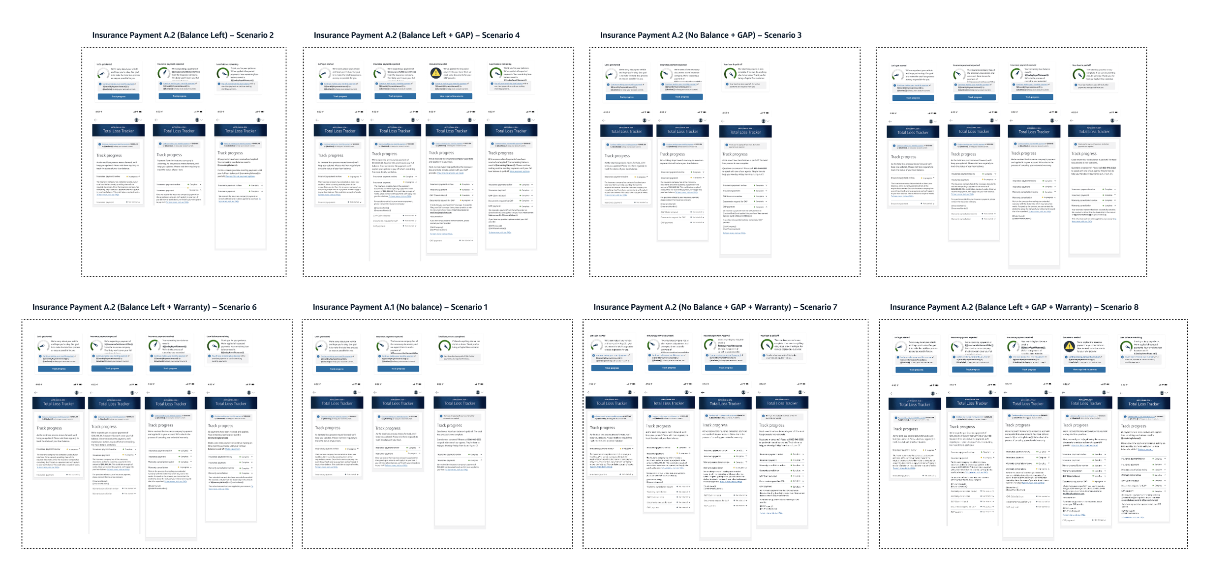
I ran a two-day discovery workshop involving product, developers, process, legal and compliance, and two fellow designers. We mapped out the end-to-end total loss process and timeline, and defined nine distinct customer scenarios based on variables like insurance settlements, GAP insurance, and warranties — along with the ideal experience for each one.
Ideation
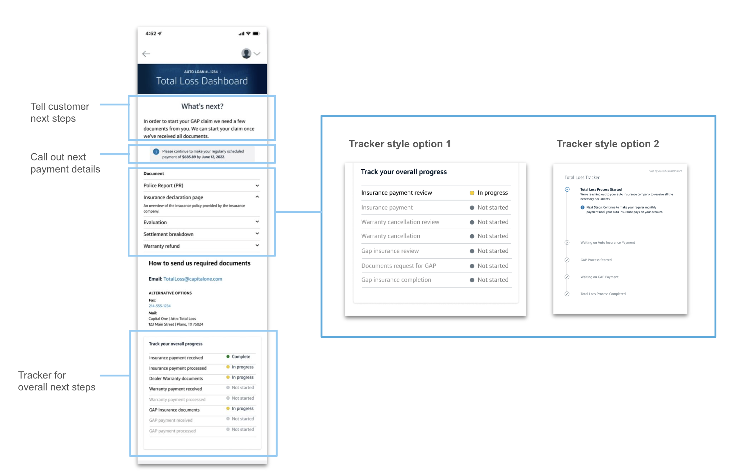
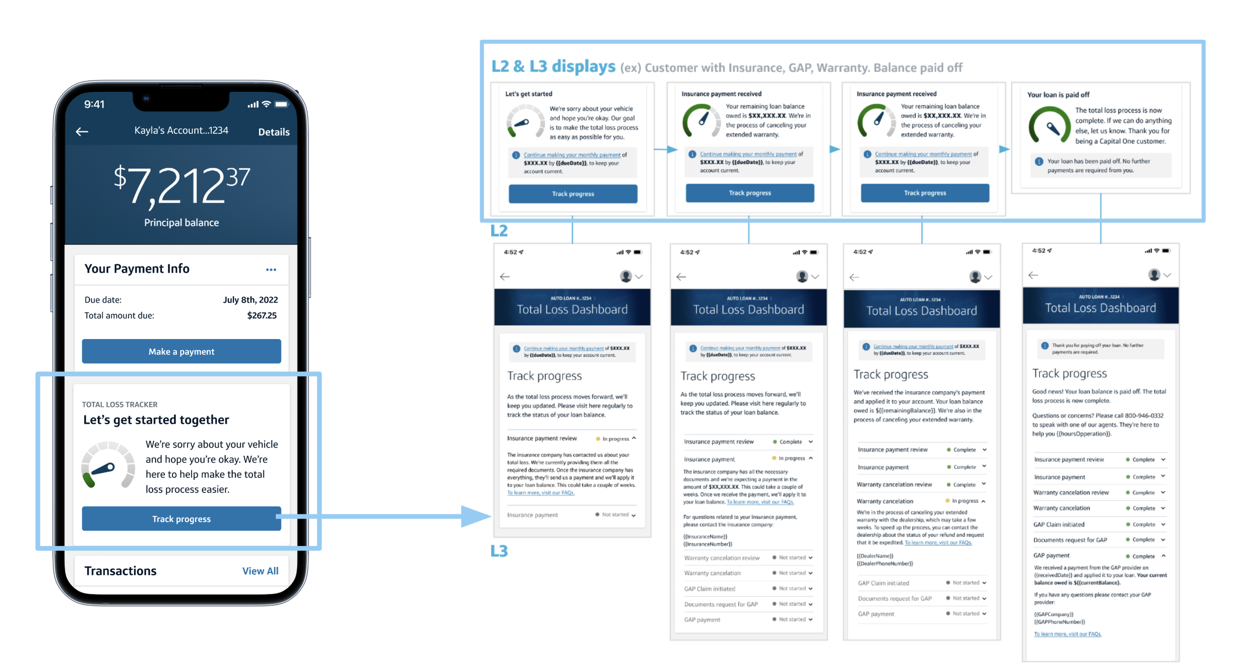
Once the scenarios were mapped, I translated them into a simplified user flow centered on a personalized "Total Loss Dashboard."
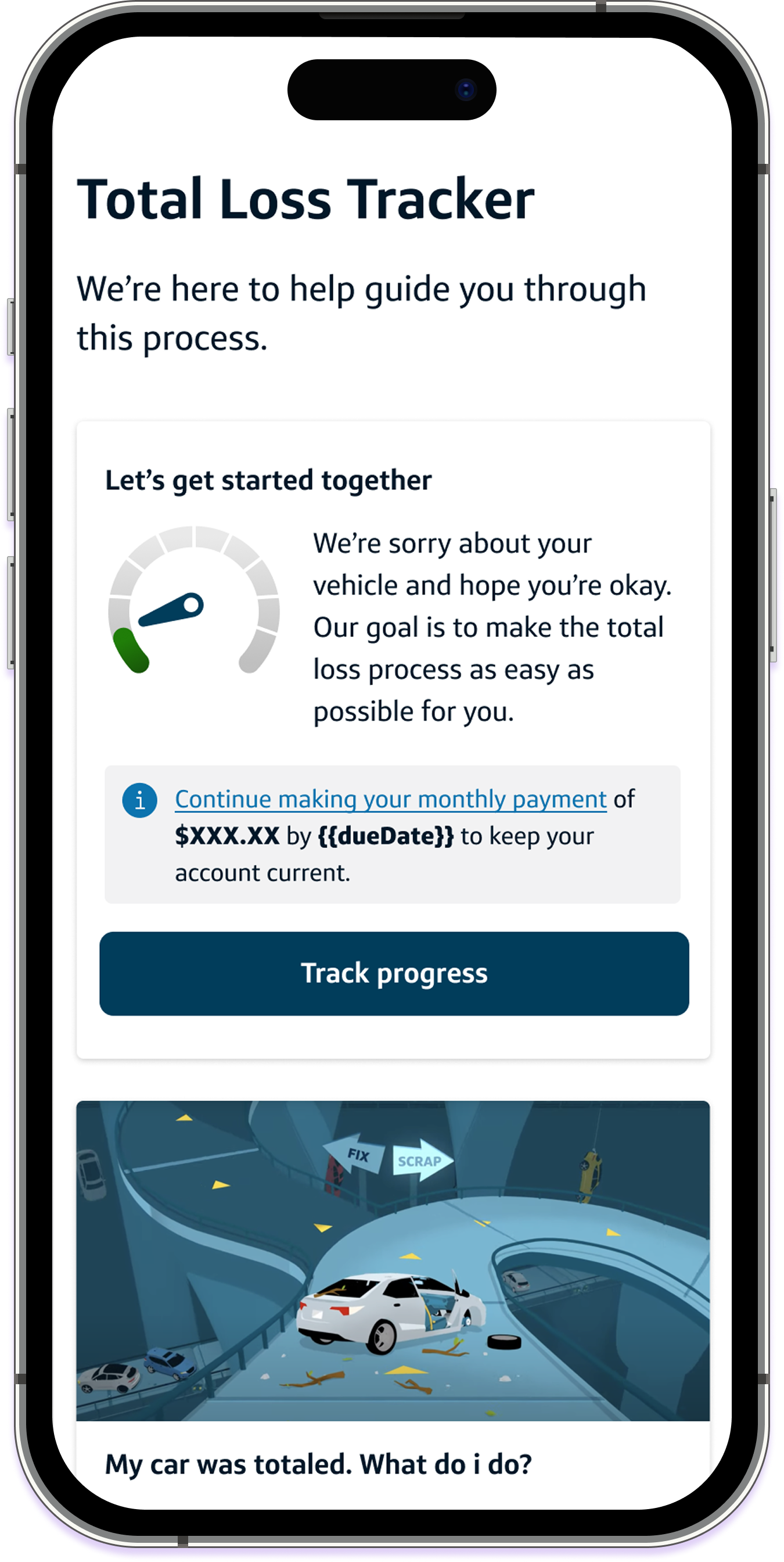
This project was heavily content-led — I needed to explain a complex, multi-variable process clearly. I created a gauge design to visualize a customer's progress and a system to display changing payment status, then developed multiple UI concepts, including two different progress tracker designs, to test against each other.
Usability Testing
Research Objective
I wanted to know whether customers understood they had to keep making their regular monthly payment throughout the total loss process, whether they knew where they stood in that process, and whether the experience left them feeling informed enough that they wouldn't still need to call us.
Hypothesis
I expected customers to understand where they were in the process and that payments were still required — but to be surprised that a payment was owed at all.
Methodology
I ran a qualitative usability study with moderated interviews, recruiting customers who had experienced a similar total loss situation to reflect the real population as closely as possible. Each participant completed tasks across two prototypes — each with a different progress tracker design — while I recorded how easily they completed each task and asked direct comprehension questions.
Findings — Process clarity
82% felt the overall experience was helpful
64% knew where they were and what the next step was
67% found the content informative
64% were unclear on what GAP insurance was or whether they had it
21% had trouble reading some of the subtext
Findings — Payment understanding
97% understood they needed to continue making their regular monthly payment
43% wanted a more detailed explanation of why payment was still required
35% pushed back on having to keep paying
Changes made from testing
Regular monthly payment: clarified messaging on why payment was still required
Additional information: expanded explanations on confusing items like GAP coverage
Design: adjusted font size and button clarity, driven by the 21% who struggled reading subtext
Rules Mapping
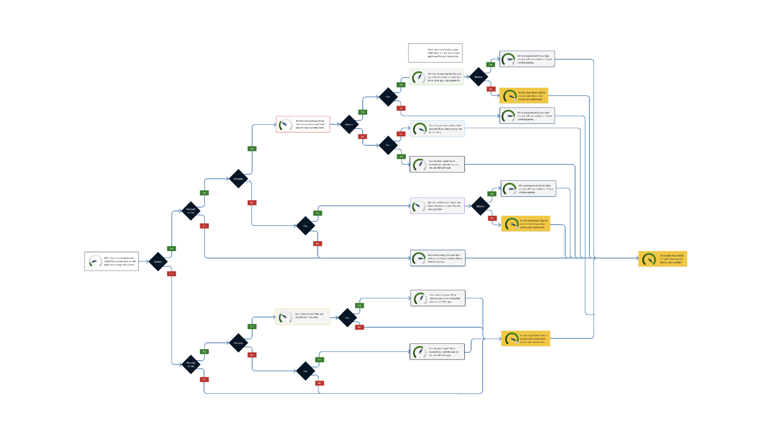
To make sure every customer scenario was accounted for and to align stakeholders, I mapped the end-to-end process against its corresponding UI and content for each scenario.
The Solution
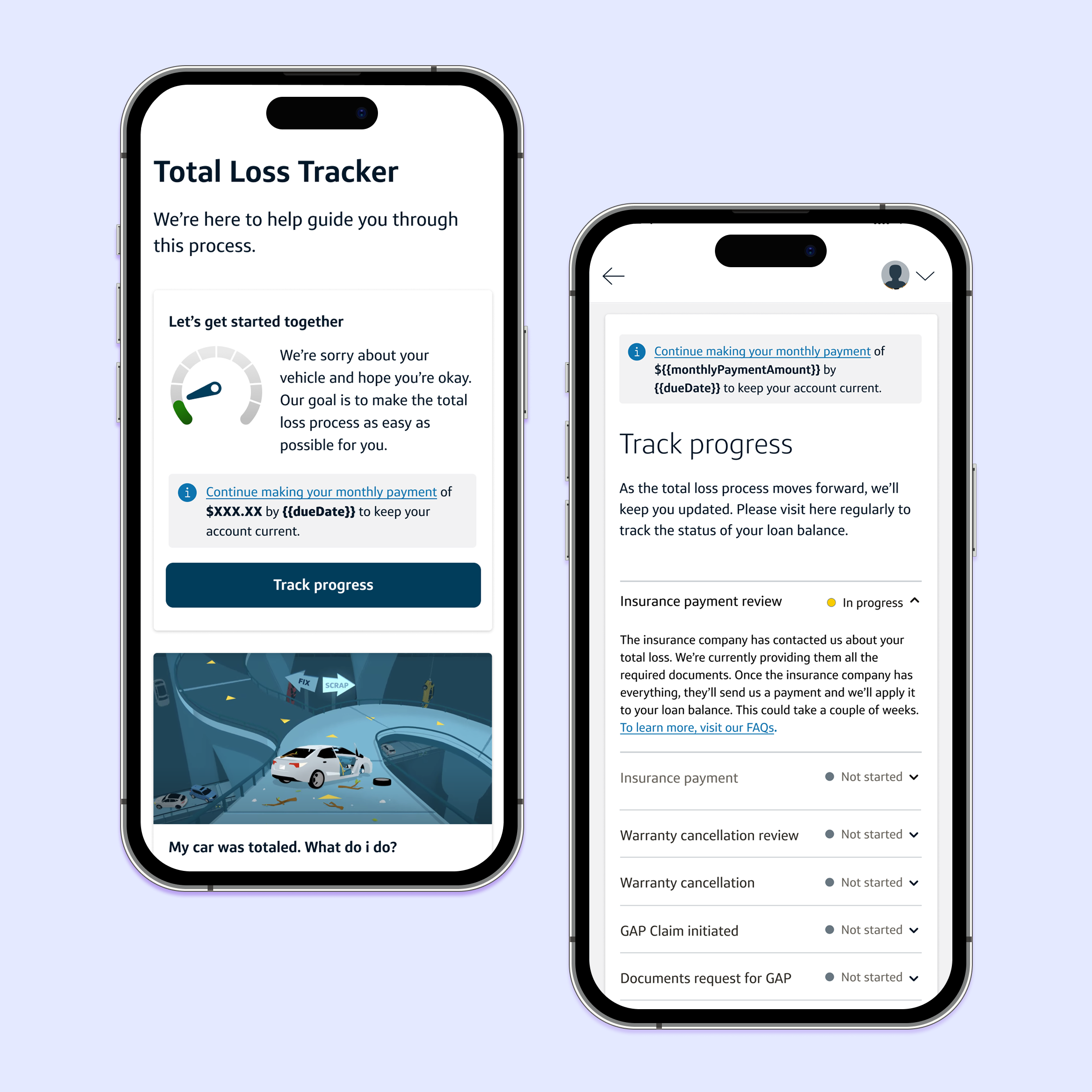
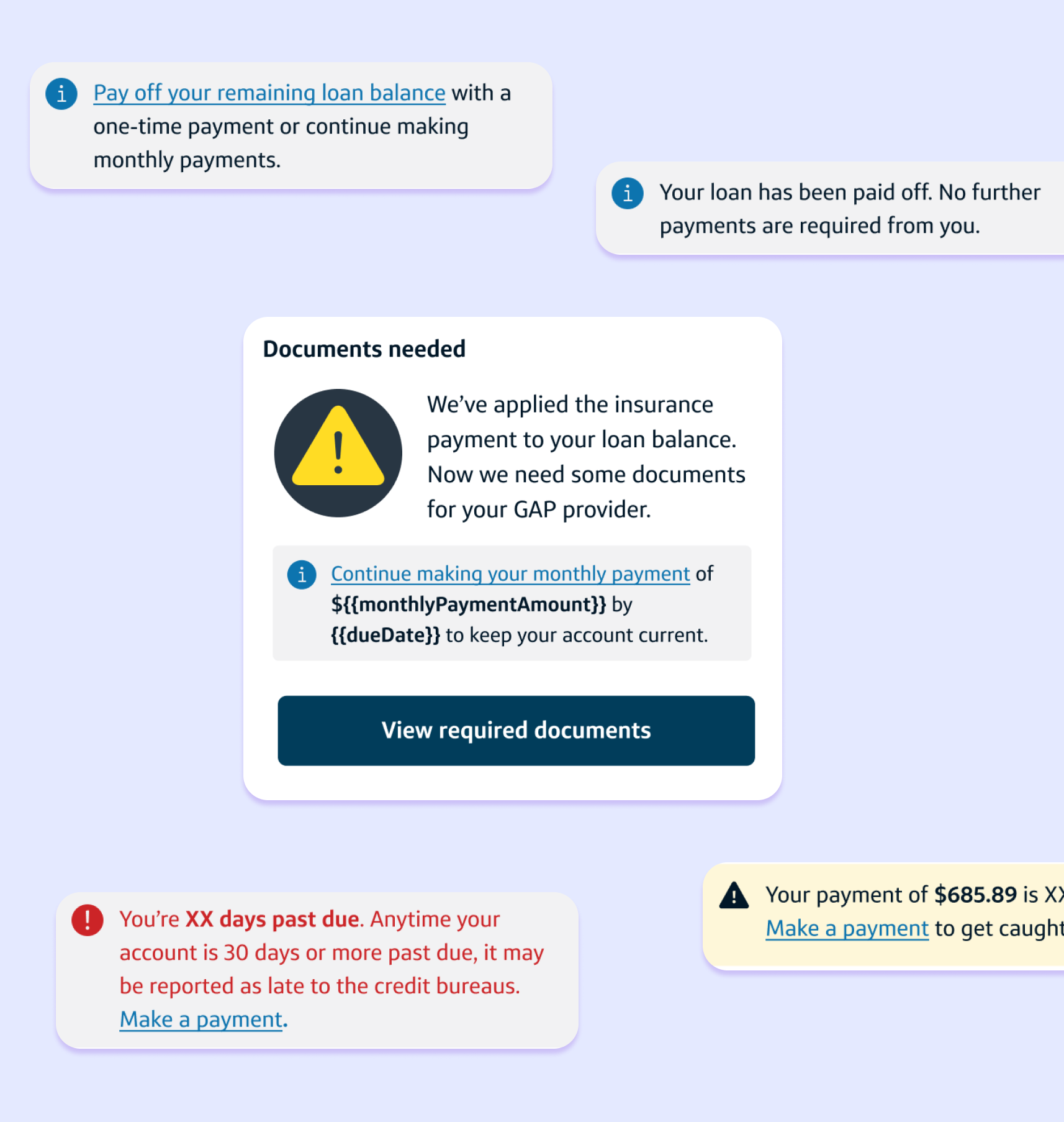
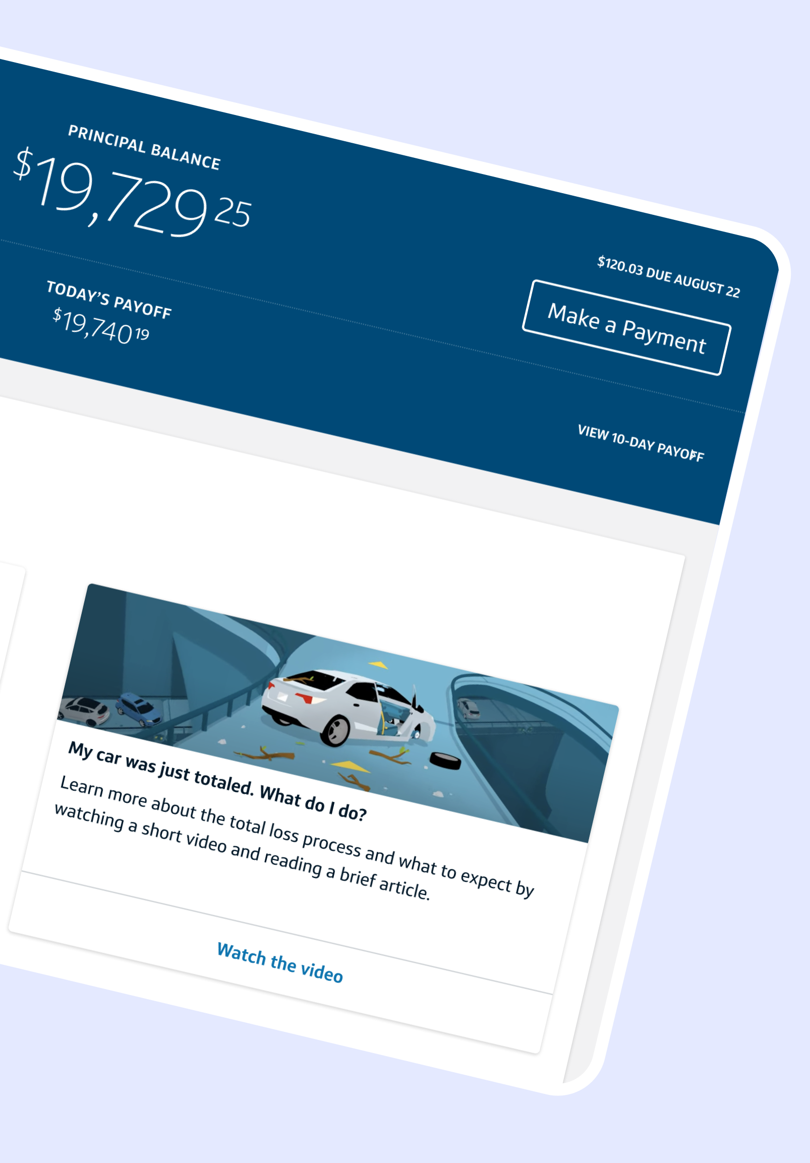
The Total Loss Tracker: A visual, multi-stage progress bar showing the status of insurance payments, warranty cancellations, and GAP claims.
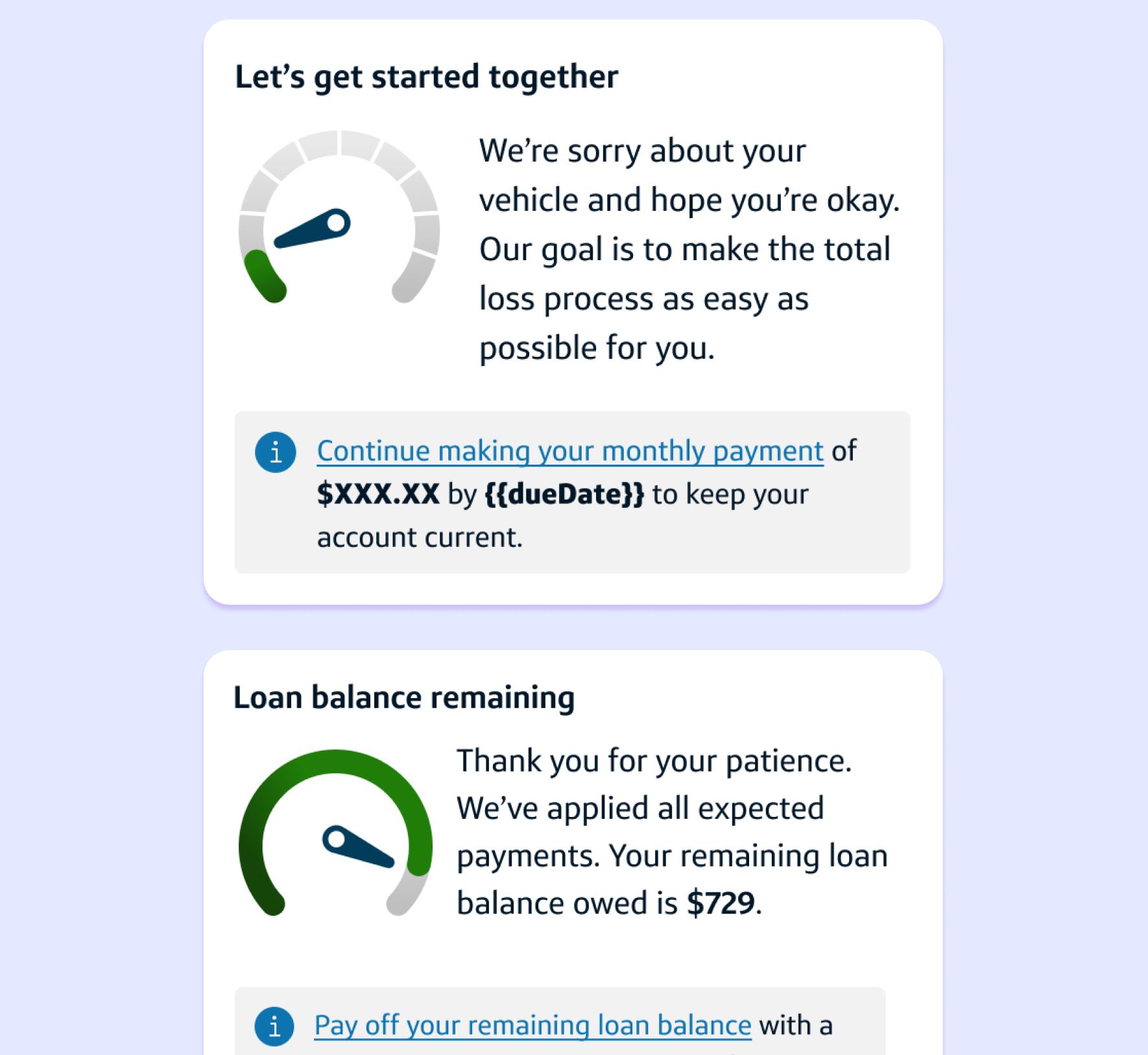
Empathy-First UX: Integrated supportive messaging to acknowledge the stress of the event while providing functional clarity.
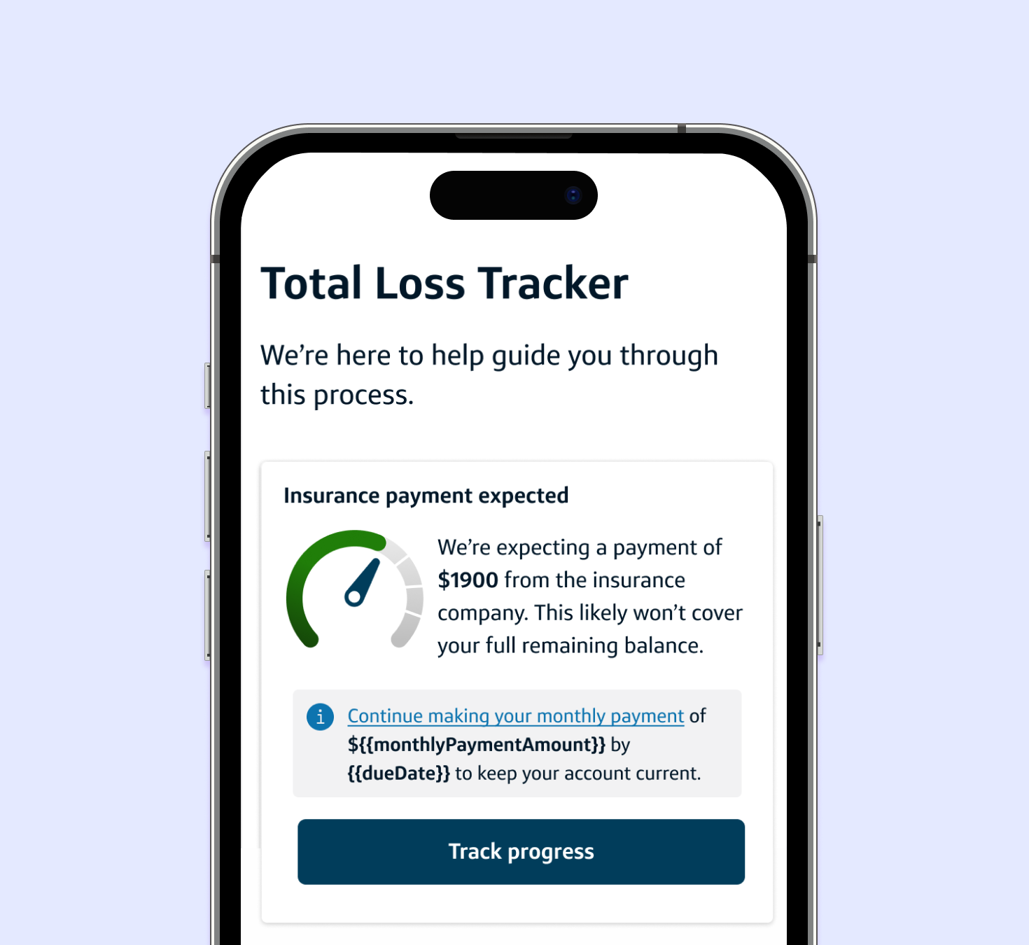
Personalized Content: Dynamic UI that updates based on the user's specific scenario (e.g., balance remaining vs. paid in full).
Clear CTAs: Dedicated sections for uploading required documents (Police Reports, Evaluations) and clear instructions on next payment details.
Built across iOS, Android, and mobile web: iOS and Android open to the tracker summary in-app and link out to the full mobile web experience to align with development constraints.
Personalized Content
Clear CTAs
Empathy-First UX
The Results
1K Reduction in Calls
Inbound calls reduced from 8k to 7k monthly.
3K Increase in Visits
Monthly visits to the experience grew from 24k to 27k.
15% Increase in Payer Rate
Customers understood their ongoing payment obligations.
🏆 Awarded Mark of Distinction
Impact earned the project a Mark of Distinction — Capital One's highest honor for performance and excellence.
Next Steps
Use of Generative AI: Optimize backend processes.
Continued enhancements: Update the customer flow based on ongoing learning and data collection.
More Product Design Work
-
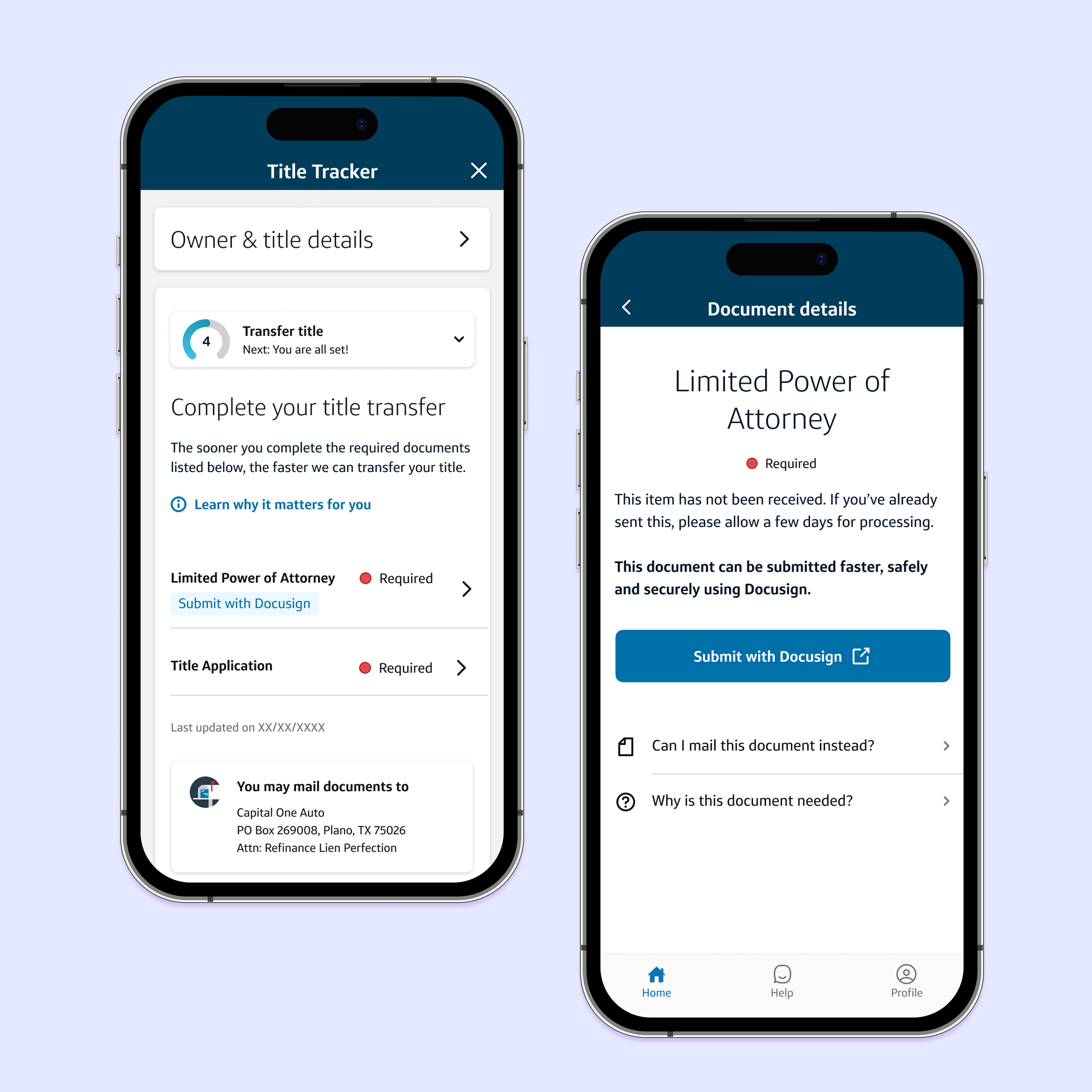
![Title Tracker Reimagined: Turning a 6-Month Black Box Into a Guided Experience]()
Title Tracker Reimagined: Turning a 6-Month Black Box Into a Guided Experience
-
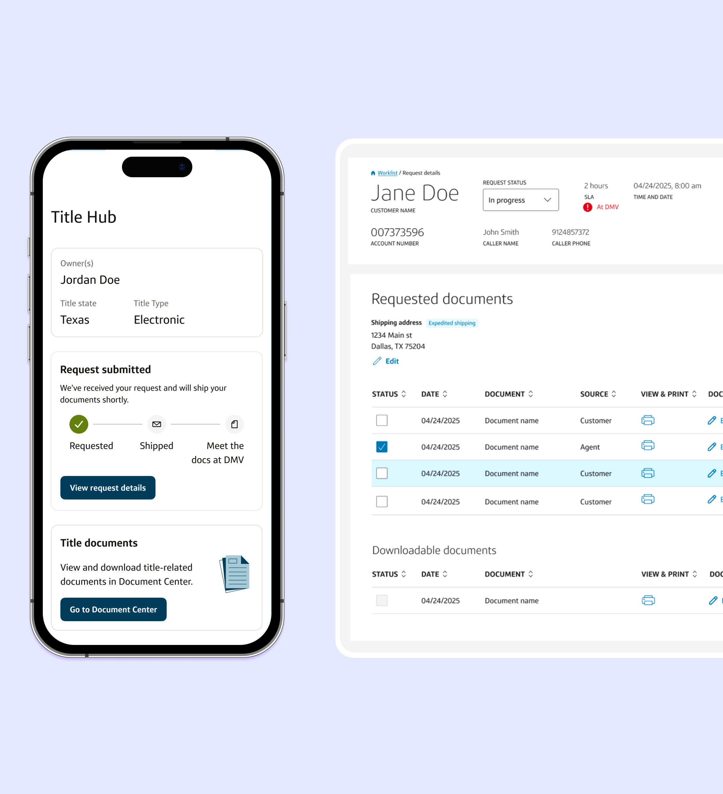
![Digital Self-Service Engine: Automating Regulatory Guidance]()
Digital Self-Service Engine: Automating Regulatory Guidance
-
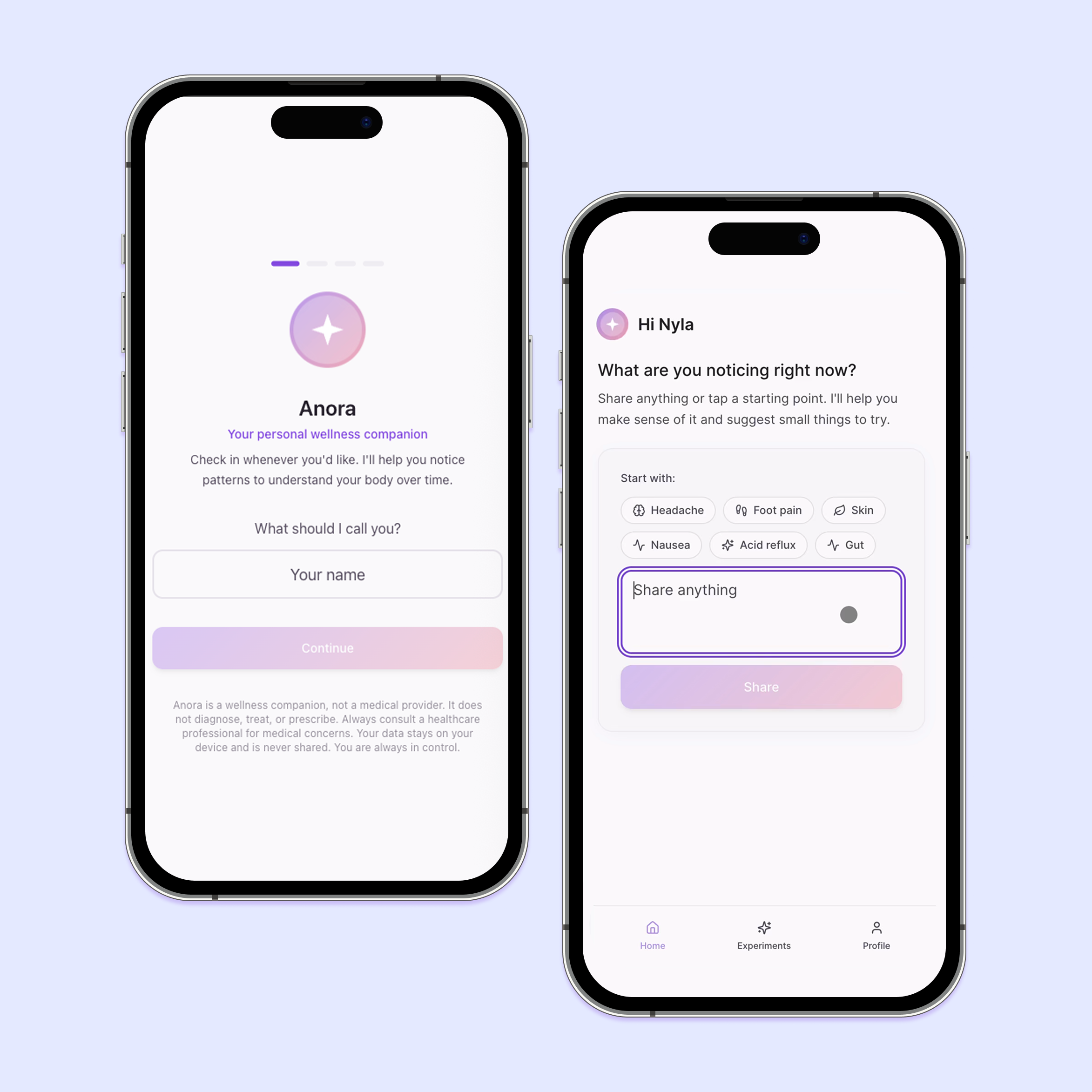
![Anora: Helping You Understand Your Body Over Time]()
Anora: Helping You Understand Your Body Over Time