
Brand Identity • Packaging • Print • Marketing • Web Design
A modern wellness brand redefining hemp-based self-care
PRISM Body Care Co.
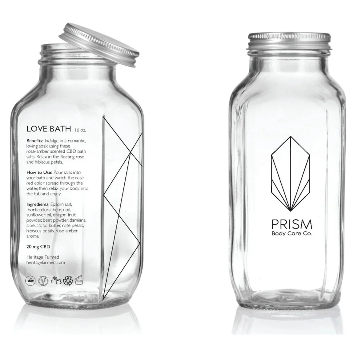
Prism was a conceptual branding project for a hemp-based body care company created during my senior year at UC Davis. The goal was to develop a visual identity that introduced CBD products to a mainstream audience by shifting the conversation away from cannabis culture and toward wellness, self-care, and everyday rituals.
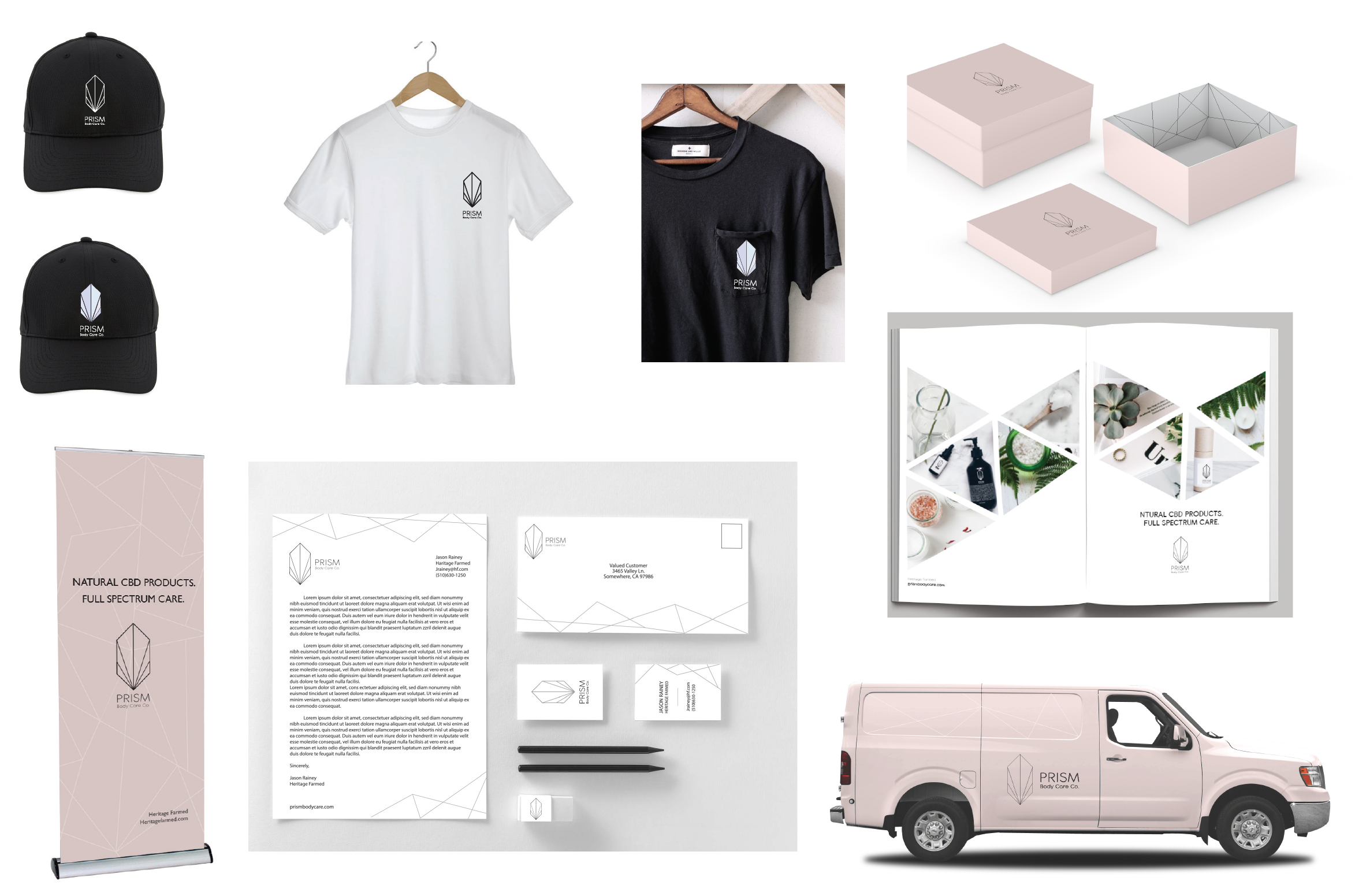
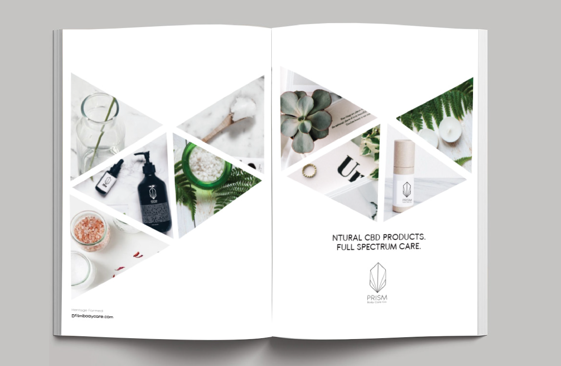
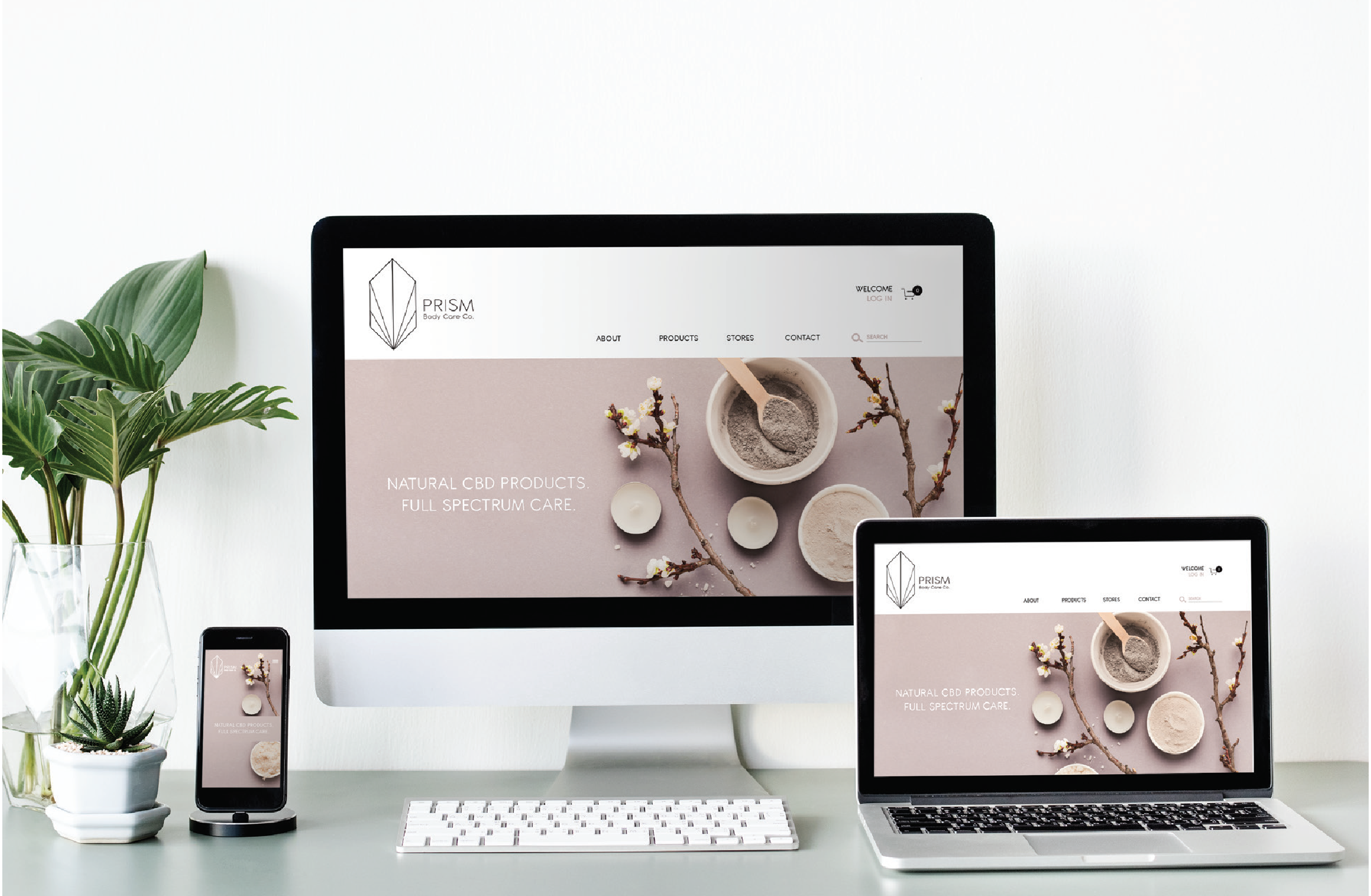
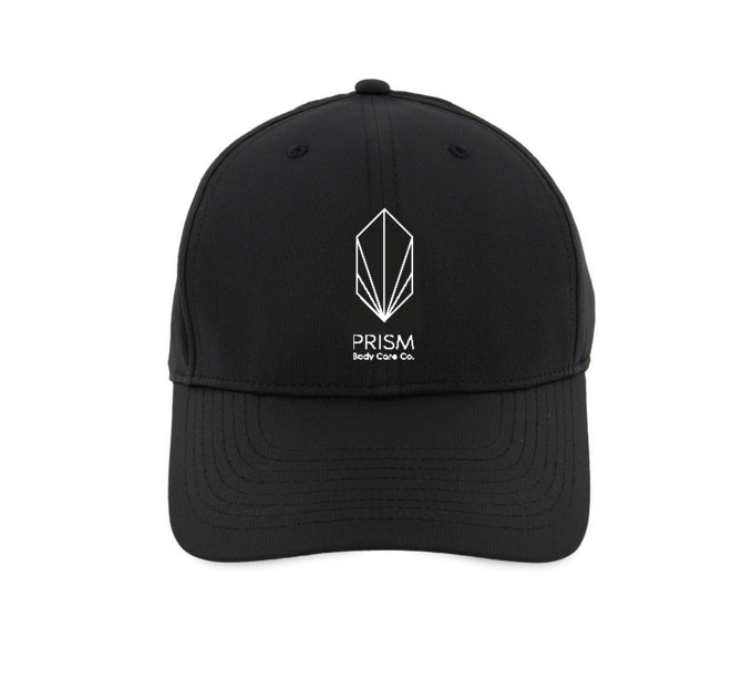
The project included a complete brand system spanning identity, packaging, marketing collateral, retail displays, digital experiences, and promotional materials.
Overview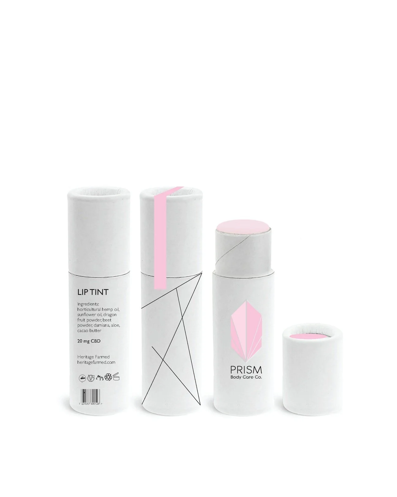
The Challenge
At the time, many CBD brands relied heavily on marijuana imagery and messaging that appealed primarily to cannabis users. Prism needed to feel approachable, modern, and trustworthy for consumers who were curious about CBD but hesitant to try it.
The challenge was to build a brand that communicated calm, wellness, and quality without relying on stereotypes associated with cannabis.
My Role
I was responsible for developing the brand from concept through execution, including:
Brand strategy and positioning
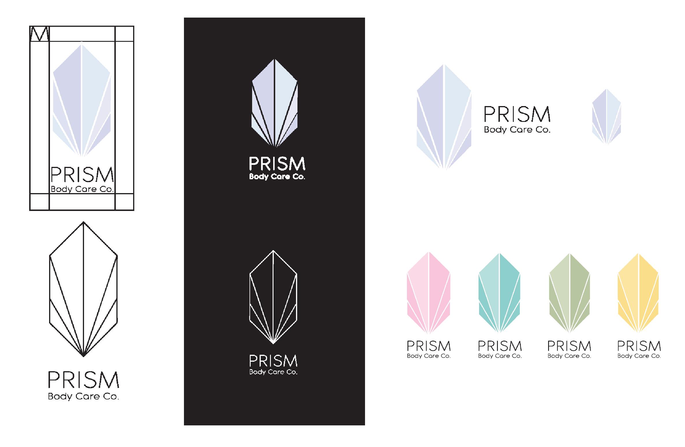
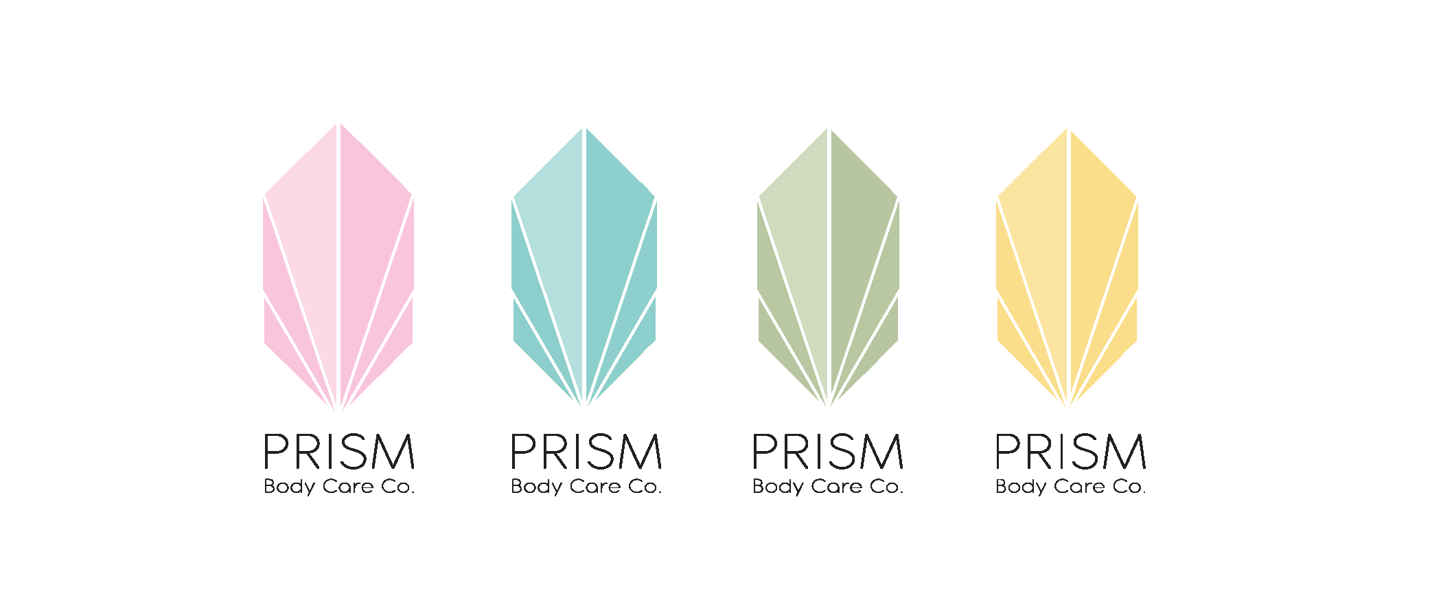
Visual identity and logo design
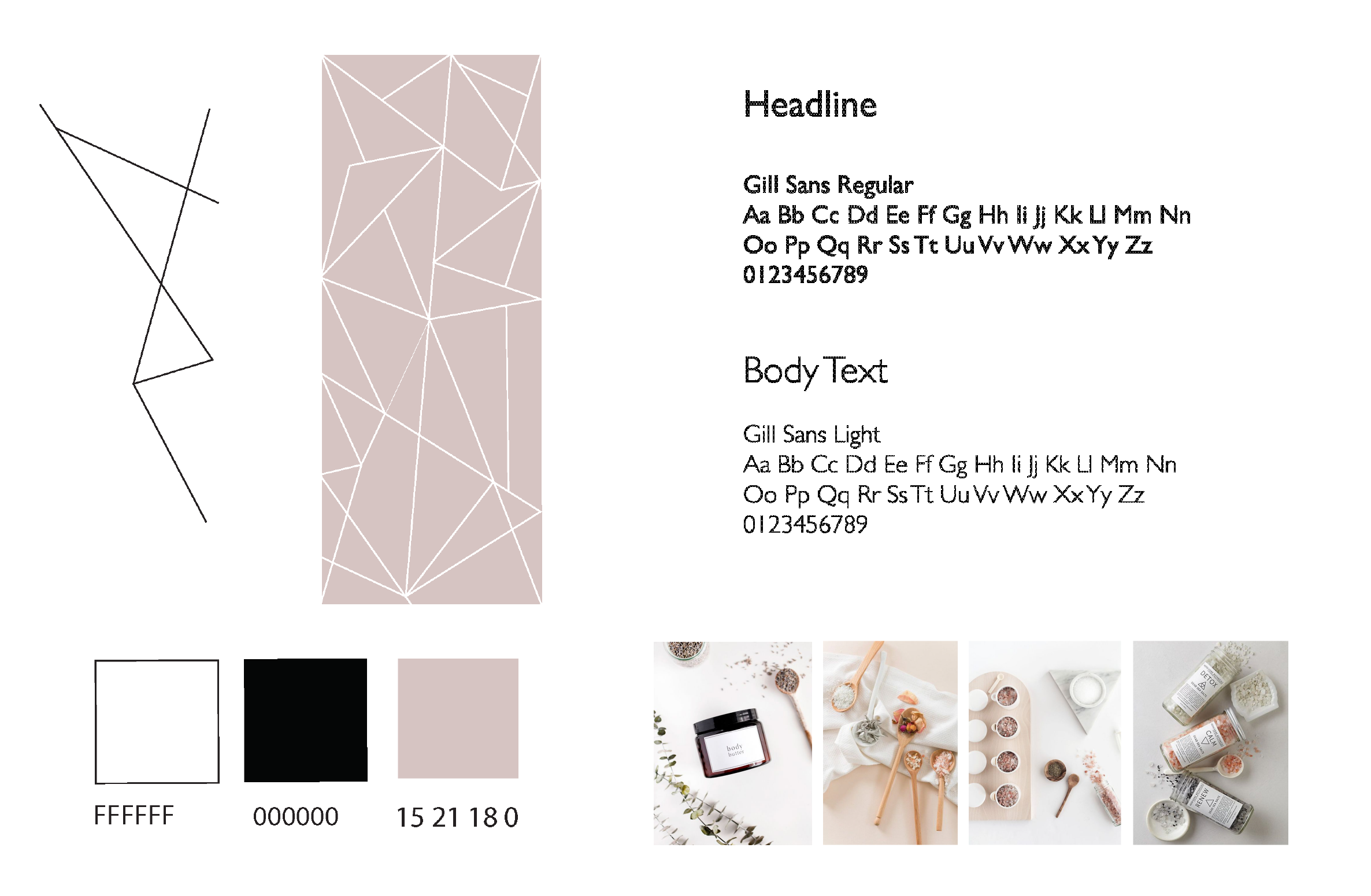
Color palette and typography
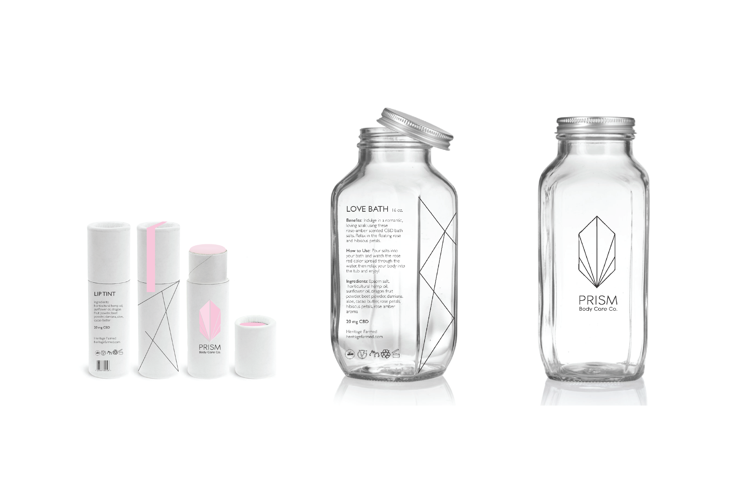
Packaging design
Marketing campaign
Print collateral
Website concepts
Social media assets
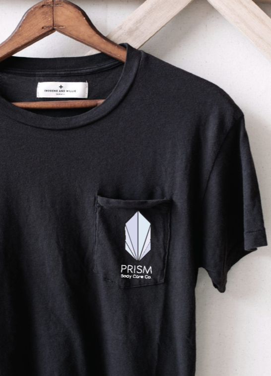
Retail applications
Design Approach
Rather than referencing hemp leaves or cannabis culture, I built the brand around the idea of bringing out your inner light through intentional self-care.
The name Prism became the foundation of the identity. Just as a prism transforms light into a spectrum of color, the brand communicates transformation, balance, and well-being.
The visual system combines:
Clean, geometric forms
Soft botanical influences
Vibrant yet calming color palettes
Minimal packaging
Modern typography
The result feels contemporary and premium while remaining approachable to first-time CBD consumers.

This project taught me how strong branding extends far beyond a logo. Every design decision needed to reinforce the same message: making an unfamiliar product feel approachable, trustworthy, and desirable. It strengthened my understanding of how research, positioning, storytelling, and visual systems come together to shape a cohesive brand experience.
Reflection